GET MARKETING INSIGHTS TO GROW YOUR AMAZON BUSINESS
– MARKET SHARE
– COMPETITOR INSIGHTS
– PRODUCT CATEGORY POTENTIAL & A LOT MORE!
User Experience (UX) is Everything: Best Practices for eCommerce Web Design and Taxonomy

When it comes to building an eCommerce website, one of the most important features you should consider is the user experience (UX for short). How will visitors become customers if they cannot easily find what they’re looking for on your site? As important as good quality content is, UX is a big part of what helps make that content findable. It also acts as the basis of your site taxonomy, which designates categories and hierarchies within your eCommerce site’s search and navigation.
Here are the top four areas of user experience you should consider while building a viable eCommerce taxonomy plan.
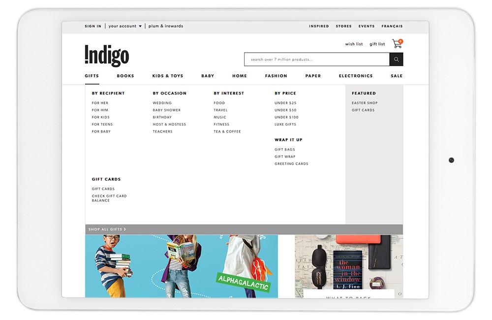
1. Imagine a Physical Store
Even though more consumers are turning to the internet to shop for products, it’s often a good practice to try and emulate the brick and mortar experience within your eCommerce website. High quality images and 360-degree photography allow an online shopper to get the full view of a product without being able to physically touch it. Items should also be categorized based on what makes the most sense for their type and use. Nobody likes a cluttered store with aisles that are difficult to navigate; the same goes for your website. In fact, according to Experience Dynamics, 79% of people who cannot easily find what they’re looking for on one site will search for the same thing on another competing site.
2. Find Your Category Sweet Spot
No eCommerce website is built the same. As such, some retailers may sell products across a wide range of categories and sub-categories while others only have a handful of offerings. If you only sell products across three categories, do not try to spread the items out into six. Distill your items into the categories that make the most sense. However, eCommerce sellers with many products shouldn’t shy away from a large number of categories, sub-categories and even sub-sub-categories if that is what makes the navigation experience easier for the shopper.
3. Not a One-Time Solution
As your company grows, it is critical for user experience that your taxonomy plan adapts with it. Add or remove categories as product offerings change or update the format of your navigation to match the look and feel of your website if it goes through a revamp. Listen to customer feedback and test the site consistently to find gaps that could be filled with better product categorization. According to Template Monster, “the customer who had an unpleasant experience on your site is 88% less likely to return.”
4. Make the Customer’s Life Easy
The main reason for adopting a user experience or taxonomy plan should always be to make the customer’s life easier. The goal here is to convert a visitor into a buyer in as few steps as possible. Faceted navigation and mobile optimization are two ways to more easily help the shopper make a purchasing decision. While faceted navigation – the ability for a shopper to filter search results by attributes such as color, price range, material, etc. – applies more to larger eCommerce stores with many categories and sub-categories, mobile optimization should be adopted by all sites regardless of size.
Everyone wants to sell more online, but not everyone is aware of the backend work it takes to organize your products in a way that allows for easy customer navigation and a better user experience. geekspeak’s Taxonomy team can handle your product organization needs, either updating your existing taxonomy practices or constructing them from the ground up.