GET MARKETING INSIGHTS TO GROW YOUR AMAZON BUSINESS
– MARKET SHARE
– COMPETITOR INSIGHTS
– PRODUCT CATEGORY POTENTIAL & A LOT MORE!
Better UX, Site Usability: What’s in it for the eCommerce store?
Creating a seamless user experience and improving usability is the goal of every successful eCommerce store. From how the site looks to how it functions, the goal is to move the customer effortlessly from the home page to the shopping cart to the checkout.
Take a look at five ways to leverage UX/Usability in the eCommerce sector that aim to improve design and boost conversions.
Let’s get logical
An eCommerce store must offer a simple, intuitive layout that engages the buyer immediately upon site entry. Without such ease of use, the potential buyer is quickly lost to other websites.
Taxonomy is about classifying the store’s product catalogue according to a logical hierarchy, allowing the user to arrive at the product of interest in as few steps as possible. Product taxonomy supports indexing, categorization and facilitates item retrieval through onsite search. Ultimately, an increase in the number of conversions can be tied directly related to the ease by which a buyer can find the item they’re looking for.
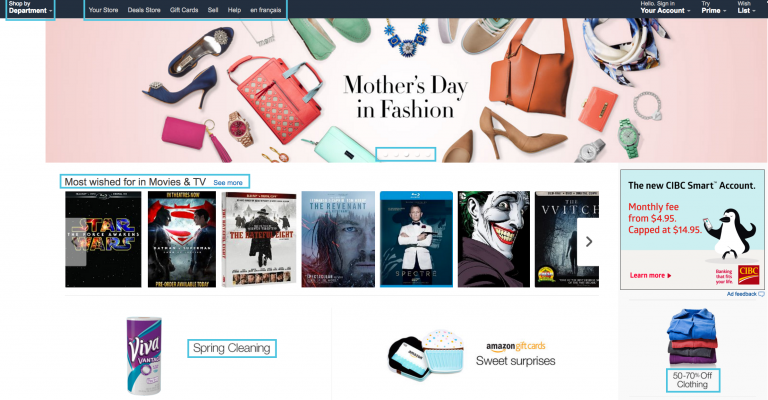
Remove the clutter
Cleaning up clutter and extraneous information leads to more focused browsing. Placing navigation menus off screen, revealing only when needed, leaves a more striking visual impression. Interaction can be a click or a simple hover; menus can drop down, pop up, or slide along.
Target’s Awesome Shop and the U.K.’s House of Fraser are two examples of eCommerce stores using the hidden menu design option to leave room for more interesting images.
Faceted search: simplifying the shopping process
Faceted search analyzes data and excludes anything that doesn’t match specific results. It simplifies the user process and offers consumers specific choices and selections. In other words, it allows the user to filter products based on the components they most desire.
Moving directly to the product that fits their shopping list means that customers are more inclined to buy rather than browse further. Faceted search gets them to where they want to go faster.
Product Loading
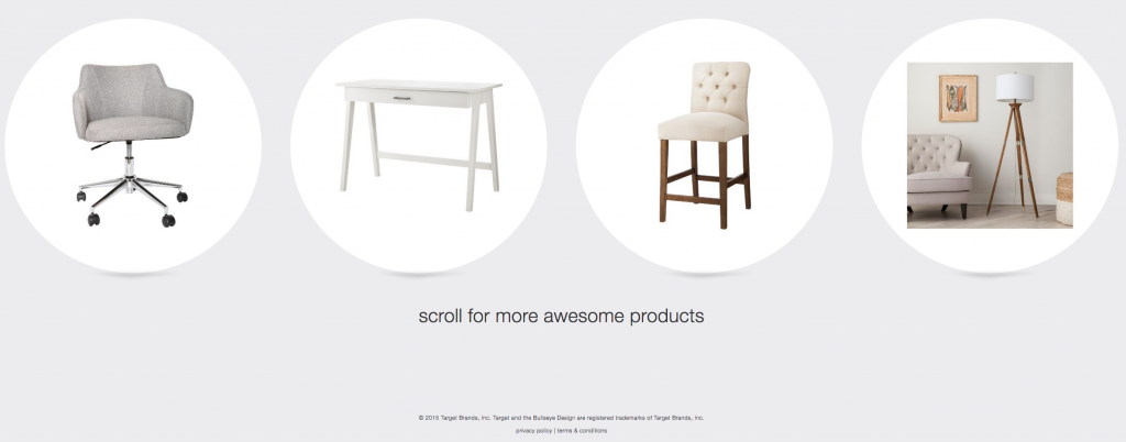
While the performance of different types of product loading – pagination, infinite scrolling, or “Load More” buttons – varies according to the context of the page and the eCommerce sector, research has shown that using “Load More” buttons combined with lazy-loading, gives the user a more seamless and positive experience.
Pagination won’t be going away any time soon as it works on just about every eCommerce platform, but test results have shown that users perceived it to be slow to load. More than a few pagination links were found to be off-putting and discouraged shoppers from browsing a product list.
Product data and a clear way to buy
According to market analysts, home improvement store, Home Depot, made a significant eCommerce gain in 2014 after overhauling its eCommerce direct fulfillment network. The business saw an increase in online sales by 36% or $1 billion.
What Home Depot knows is that customers need adequate information before they will purchase online. Home Depot and other online hardware stores have realized that effective product pages use a combination of text and images to detail not only the product but also the price, availability, and a clear way to purchase the item.
The successful eCommerce store will design a site that details the product and presents it in a way to entice users to purchase. Keep it simple and quick to load, especially on mobile devices. Above all, be logical and allow for product filtering.