Cracking the Code of Mobile UX: Creating Intuitive Ecommerce Experiences for Small Screens
Published: September 8, 2023 | Case Studies & Guides, Content & Design, E-Commerce Strategy, Tips & Tricks

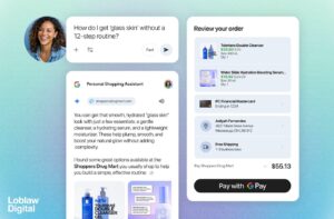
In today’s fast-paced digital world, mobile devices have become an essential tool for shopping online. Whether you’re browsing during your daily commute or looking for a quick purchase while on the go, mobile shopping has transformed the way we interact with ecommerce platforms. As a result, optimizing your online store for mobile users has never been more critical. In this beginner’s guide, we’ll walk you through the steps of creating mobile-friendly, responsive, and optimized ecommerce experiences that delight users and drive conversions.
Understanding the Mobile Landscape
Mobile devices have revolutionized the way we shop. More and more users turn to their smartphones and tablets to make purchases, making it imperative for ecommerce businesses to adapt their strategies. When it comes to mobile shopping, the user experience (UX) takes center stage. To succeed, you need to crack the code of mobile UX.
The Essentials of Mobile-Friendly Design
A mobile-friendly design is the foundation of a successful ecommerce platform. Here’s how you can make your website small-screen ready:
- Responsive Design: Ensure your website layout adapts seamlessly to different screen sizes. Elements like buttons, images, and text should scale appropriately.
- Intuitive Navigation: Simplify navigation by using a clear and concise menu. Implement a search bar for quick product searches.
- Touch-Friendly Buttons: Design buttons that are easy to tap and well-spaced to prevent accidental clicks.
- Streamlined Content: Prioritize content that matters most to mobile shoppers. Keep descriptions concise and images optimized for fast loading.
Optimizing the Checkout Process
The checkout process can make or break a sale, especially on mobile devices. Streamline the process to minimize cart abandonment:
- Guest Checkout: Allow users to check out without creating an account.
- Auto-Fill: Autofill fields wherever possible to reduce typing effort.
- Progress Indicators: Show users how far they are in the checkout process to set clear expectations.
- Multiple Payment Options: Offer various payment methods for convenience.
Designing for Mobile Speed
Mobile users are often on the move, relying on varying network speeds. Slow-loading websites can be a major turnoff. Here’s how to enhance mobile speed:
- Image Optimization: Compress images to maintain quality while reducing file size.
- Caching: Utilize browser caching to store frequently accessed data and speed up subsequent visits.
- Minimize Redirects: Each redirect adds loading time. Keep them to a minimum.
- Content Delivery Networks (CDNs): Use CDNs to distribute content across multiple servers, reducing server load and latency.
Visual Appeal on Small Screens
Mobile-friendly design doesn’t mean compromising on visual appeal. Here’s how to strike a balance:
- Clear Product Images: Use high-quality images with zoom functionality for a closer look.
- Short and Engaging Descriptions: Craft concise yet compelling product descriptions.
- Mobile-Optimized Videos: If using videos, ensure they’re responsive and don’t slow down the page.
- User-Generated Content: Showcase customer reviews and images for social proof.
Testing and Iteration
Creating an optimized mobile ecommerce experience is an ongoing process. Regularly test your website across different devices and screen sizes to identify areas for improvement. Solicit user feedback to understand pain points and address them. Stay updated with the latest mobile UX trends to remain ahead of the curve.
Creating an intuitive mobile shopping experience is no longer optional—it’s essential for the success of your ecommerce business. By following these steps and focusing on mobile-friendly design, responsive layouts, and a seamless user experience, you can crack the code of mobile UX and create ecommerce experiences that convert visitors into loyal customers.
Ready to elevate your ecommerce game? Contact us today to learn more about how our expert services can enhance your online store’s mobile experience.