Creating an Efficient Ecommerce Checkout Process: A Technical Guide
Published: August 28, 2023 | Case Studies & Guides, E-Commerce Strategy, Retail & Commerce, Tips & Tricks

The checkout process can make or break an ecommerce sale. An efficient, streamlined checkout can drastically reduce cart abandonment rates and enhance user experience.
Single Page vs. Multi-Page Checkout:
- Single Page: All elements of the checkout process (billing, shipping, review) on one page. This is quick but might appear cluttered.
- Multi-Page: Steps are spread across multiple pages. Offers a clean look but might seem long.
- Recommendation: A/B test to see which resonates with your audience. However, most modern ecommerce sites are leaning towards single-page checkouts for efficiency.
Guest Checkout:
- Allow users to complete their purchase without creating an account.
- Offer an option to create an account after purchase for faster future checkouts.
Auto-fill and Predictive Input:
- Use browser capabilities to auto-fill details.
- Implement predictive input for fields like city, state, and country.
Dynamic Form Validation:
- Validate form inputs in real-time.
- If a user inputs an incorrect email or misses a required field, highlight it immediately.
Efficient Error Messaging:
- Be specific with error messages. Instead of “Invalid Input,” use “Please enter a valid email address.”
Progress Indicator:
- Especially for multi-page checkouts, display a progress indicator to let users know how many steps are remaining.
Diverse Payment Options:
- Apart from regular credit/debit cards, integrate options like PayPal, Apple Pay, and other regional popular payment methods.
Security Reassurance:
- Display security badges and ensure the checkout page is HTTPS encrypted.
- Provide tooltips for CVV/CVC, showcasing that it’s for security purposes.
Transparent Costs:
- Display a cost breakdown including product, shipping, taxes, and any discounts.
- Offer a price calculator for shipping and taxes based on location.
Clear Call-to-Action (CTA):
- Use vibrant colors and clear text for the final purchase button.
- Avoid using technical jargon. “Place Order” or “Complete Purchase” are universally understood.
Order Summary:
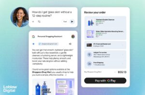
- Always display an order summary, including product images, so users can quickly review their cart.
Cross-Selling and Upselling (with Caution):
- Consider offering complementary products, but ensure it doesn’t complicate the checkout process.
- Always offer an option to easily return to the checkout if a user decides to add another product.
Optimize for Mobile:
- Ensure your checkout process is responsive and optimized for mobile devices.
- Implement mobile-friendly payment options.
Efficient Loading Times:
- Use technical optimization techniques such as compressing images and leveraging browser caching to ensure the checkout pages load quickly.
Post-Purchase Experience:
- Once the order is complete, redirect users to a clear confirmation page.
- Provide details on next steps, like order tracking and customer support.
Optimizing the checkout process requires a combination of technical efficiency and user-centric design. Regularly gather feedback and perform A/B testing to continuously refine and perfect the process, ensuring customers have a seamless purchasing experience.


